A Loud Identity for Those Off the Grid
Balance
A Loud Identity For Those Off the Grid
Balance
Balance doesn't just care for those who slip through the cracks – they champion them. Dive into a brand that's as as one-of-a-kind and exceptional as the people it serves.
Challenge
For many with cognitive and physical impairments, the world often feels designed for a „normal“ that they don’t belong to. They’re left on the outside, often missing out on what’s possible. Balance, an ambulant care service, is reshaping this „normal“ and asked us to craft a new visual and verbal identity for their mission.
Solution
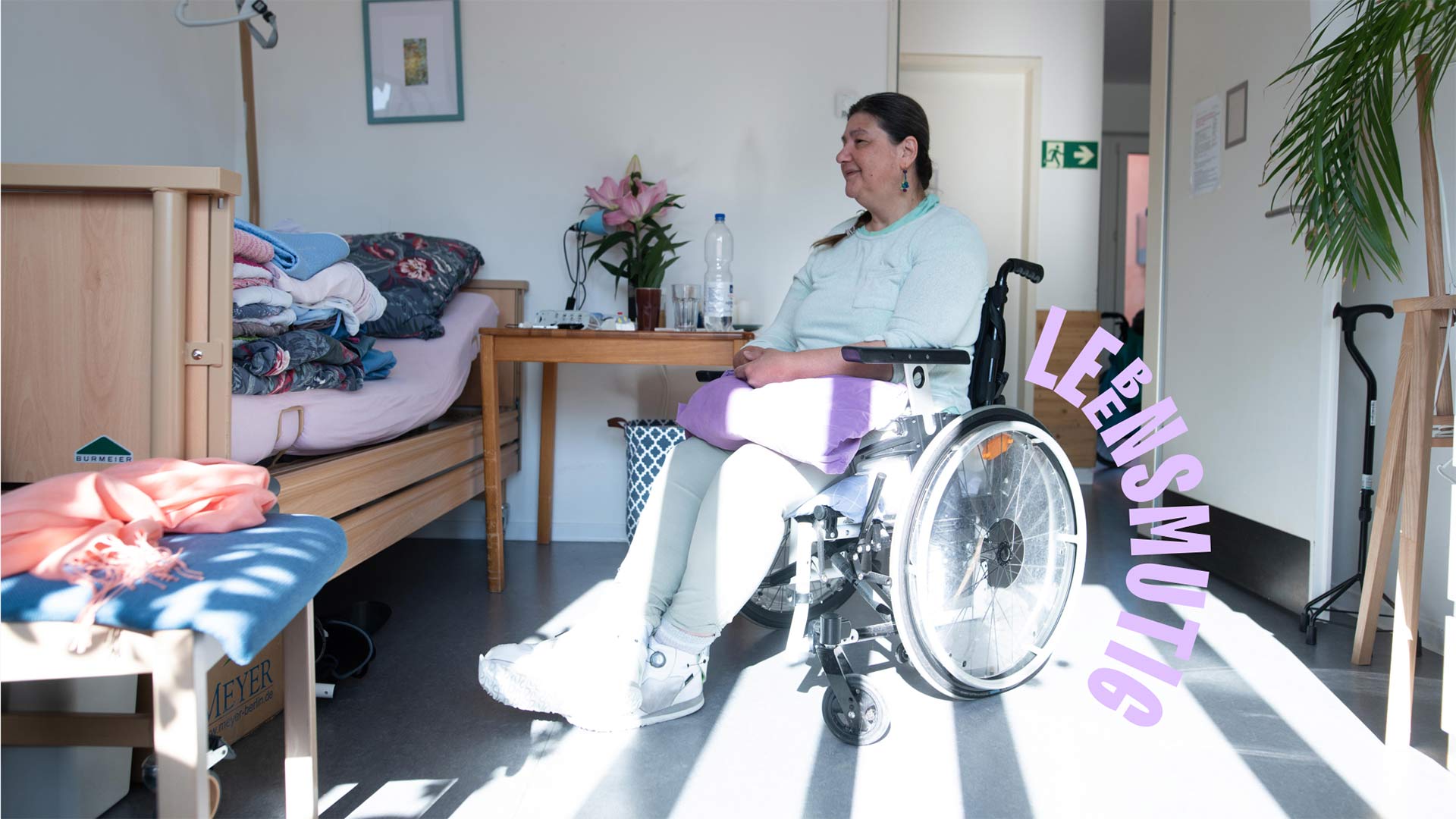
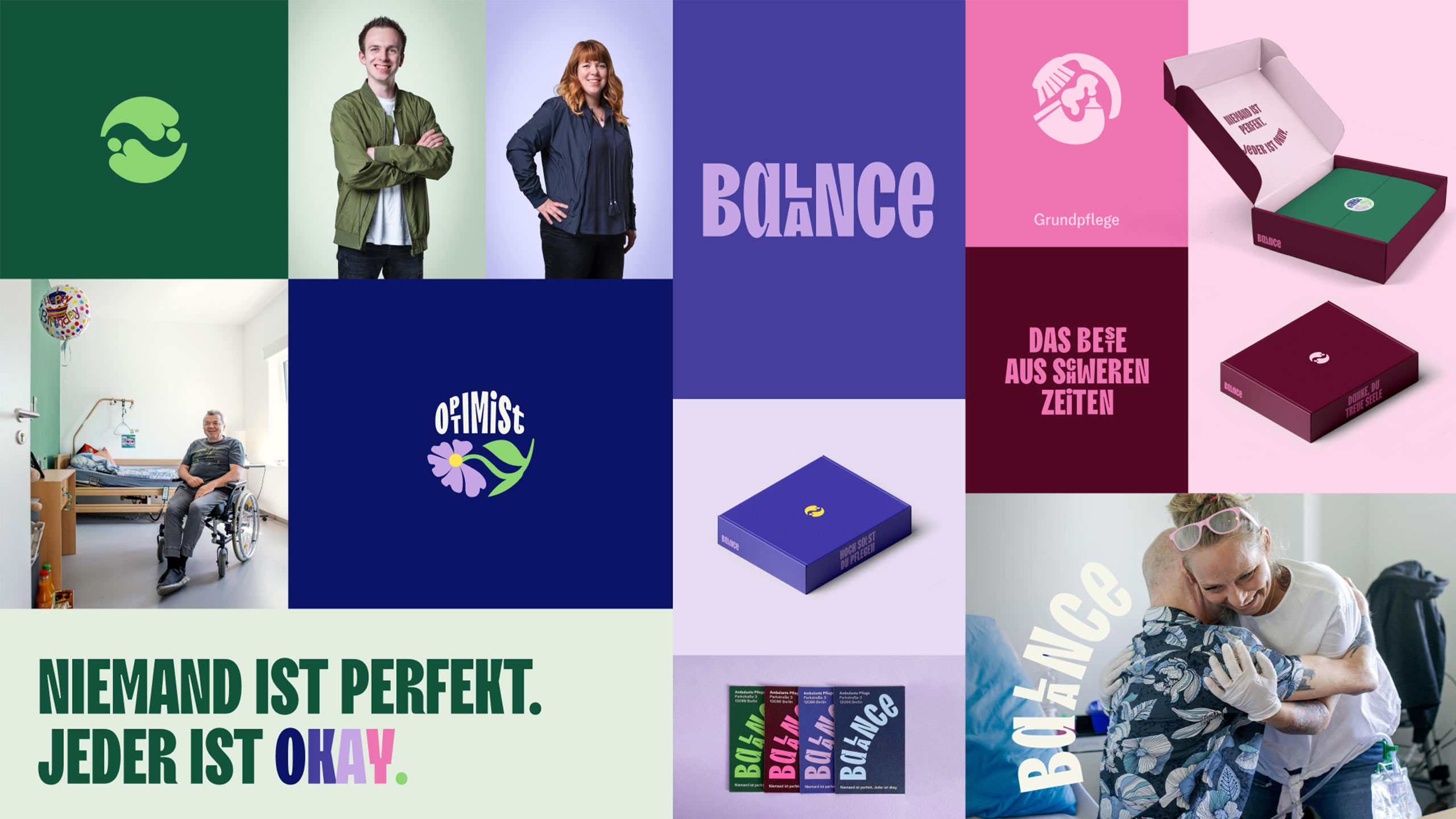
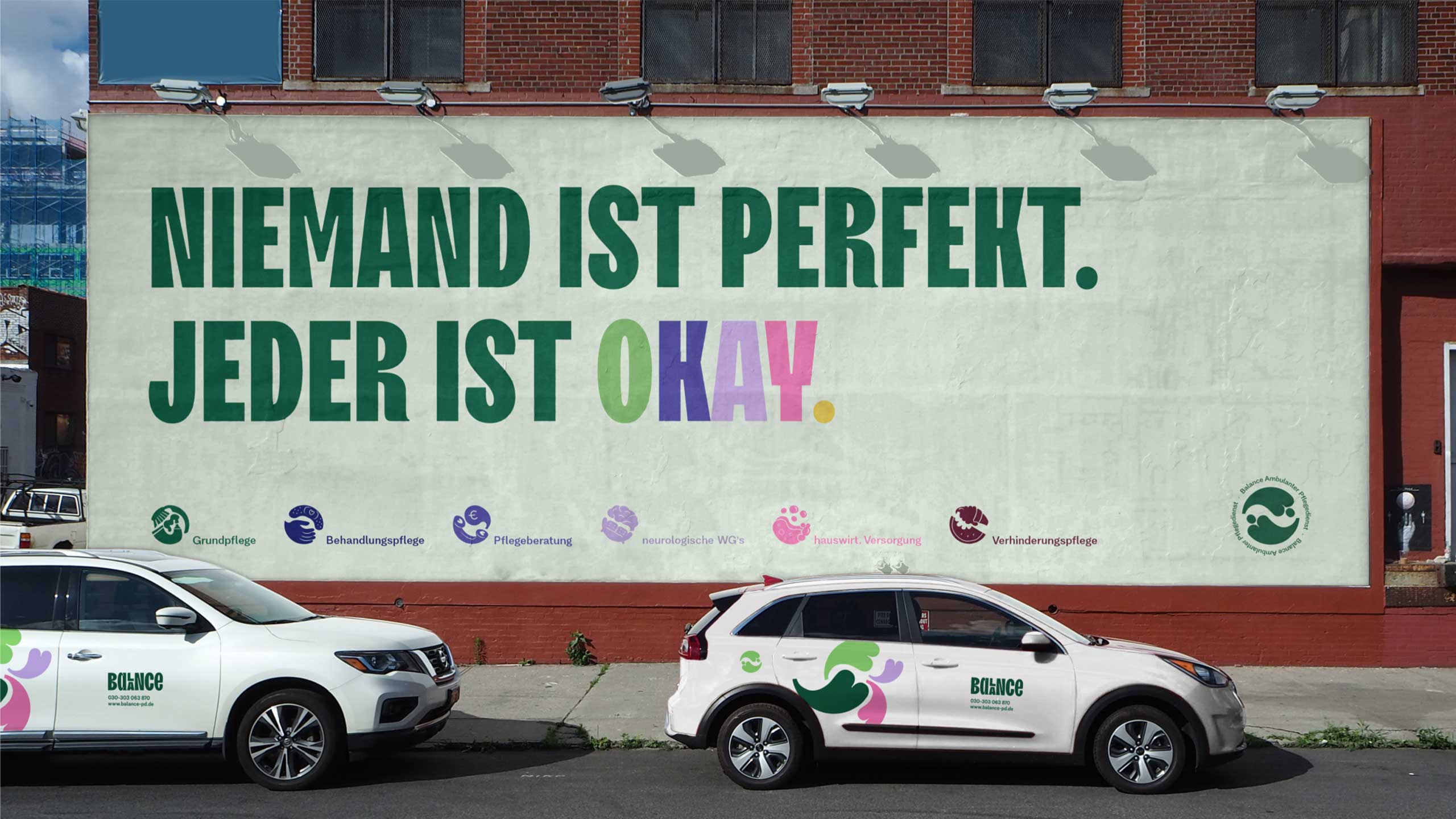
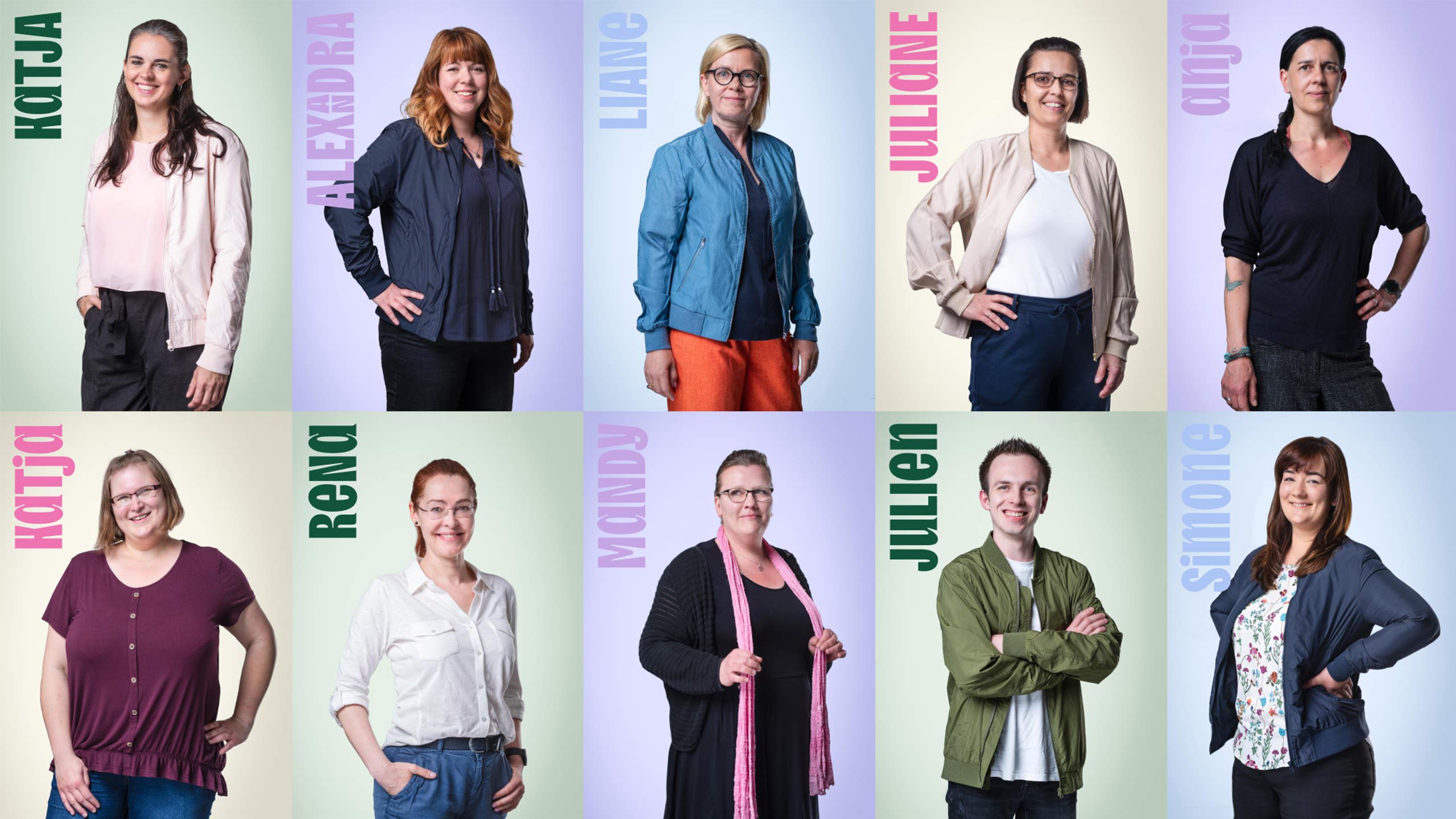
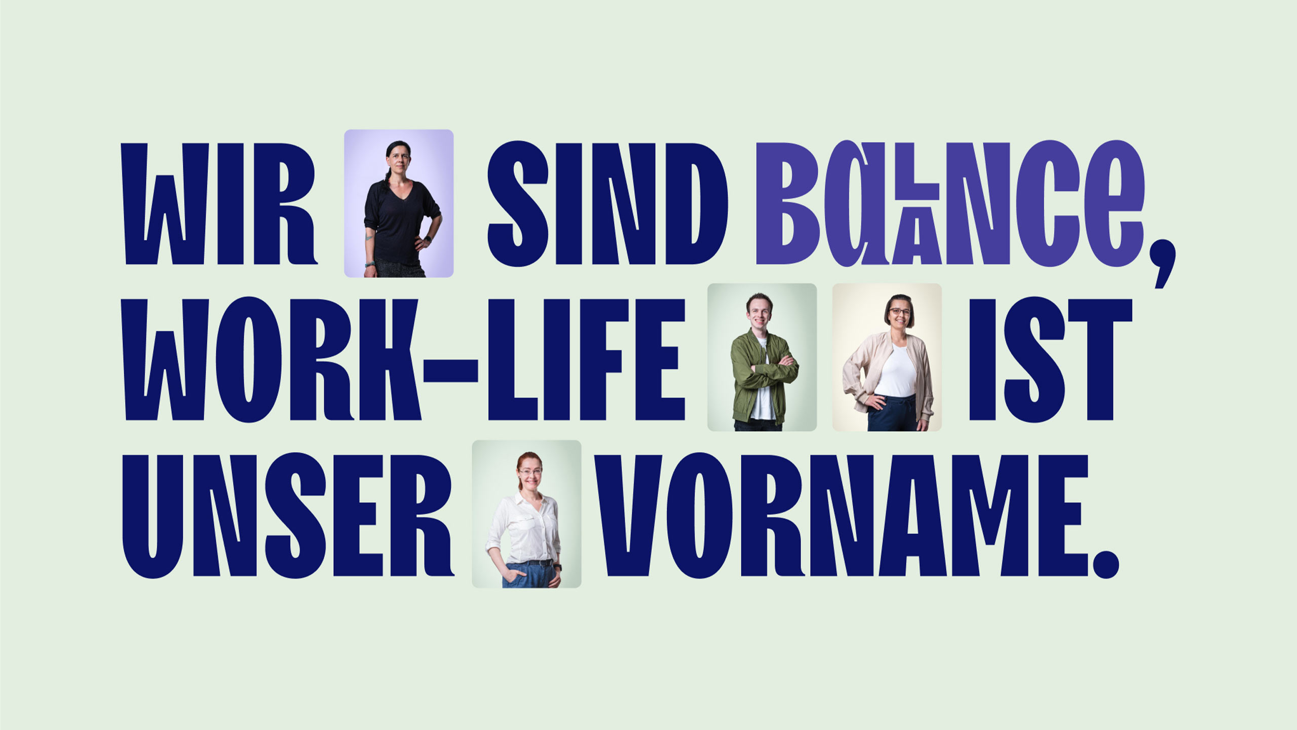
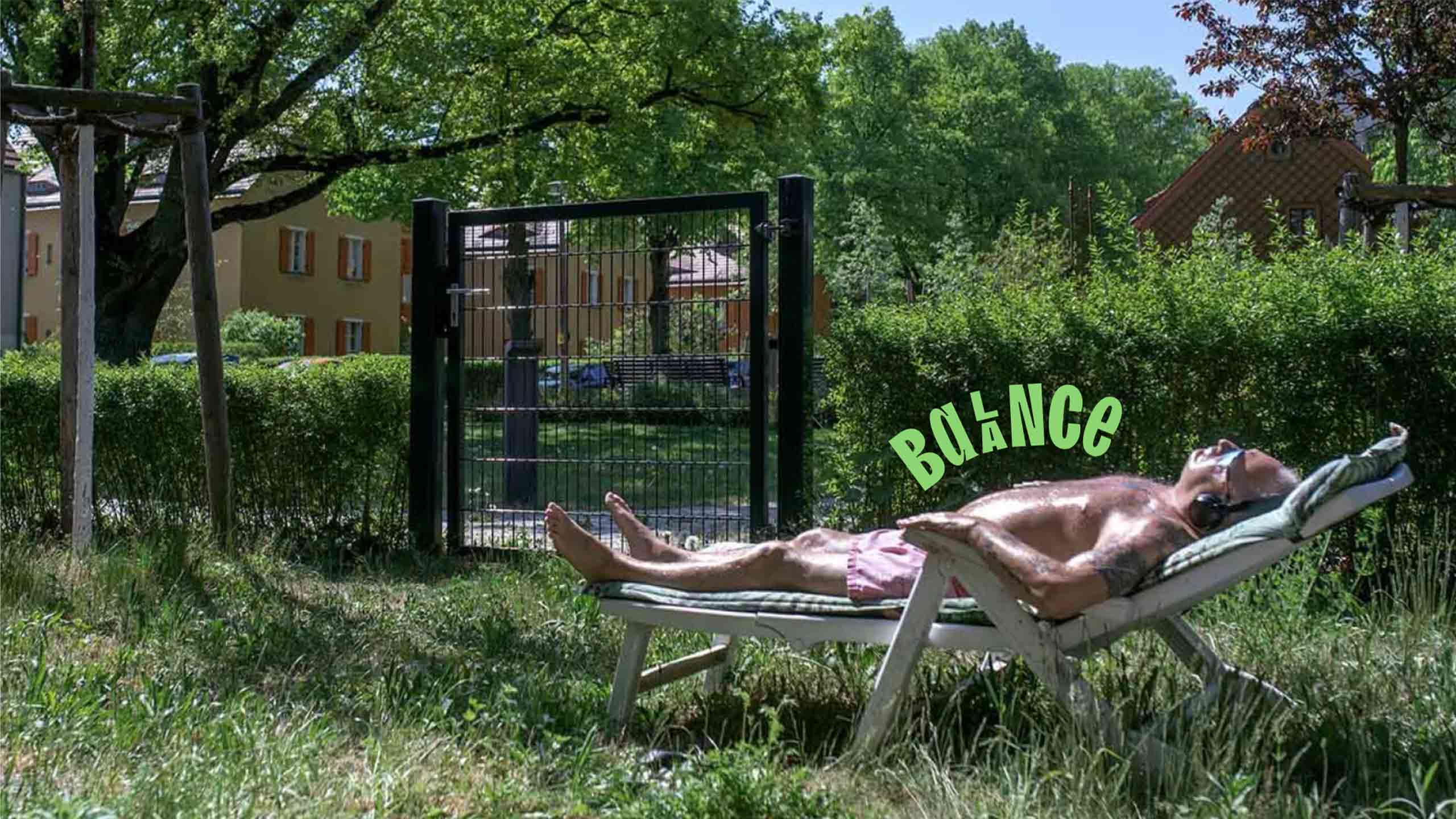
Balance specializes in those cases that typically slip through the cracks. Their identity now reflects this, becoming a special case itself: with a typographic system that takes inclusion literally and a color palette that focuses on vibrancy rather than reverence. Because at Balance, the motto is: Nobody’s perfect, everybody’s okay. This ethos is brought to life with documentary-style photos and high-quality staff portraits.
Impact
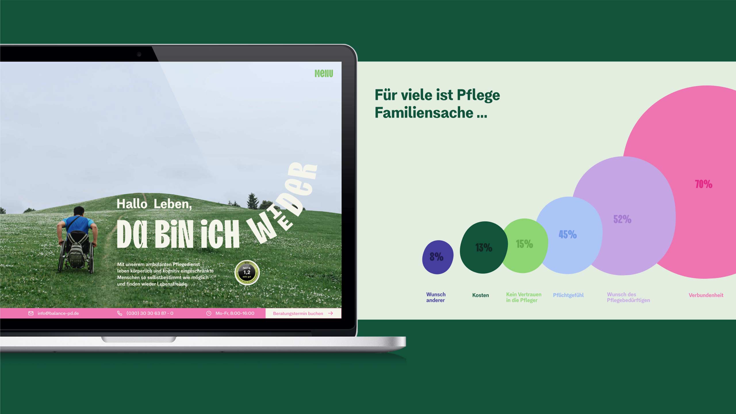
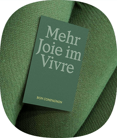
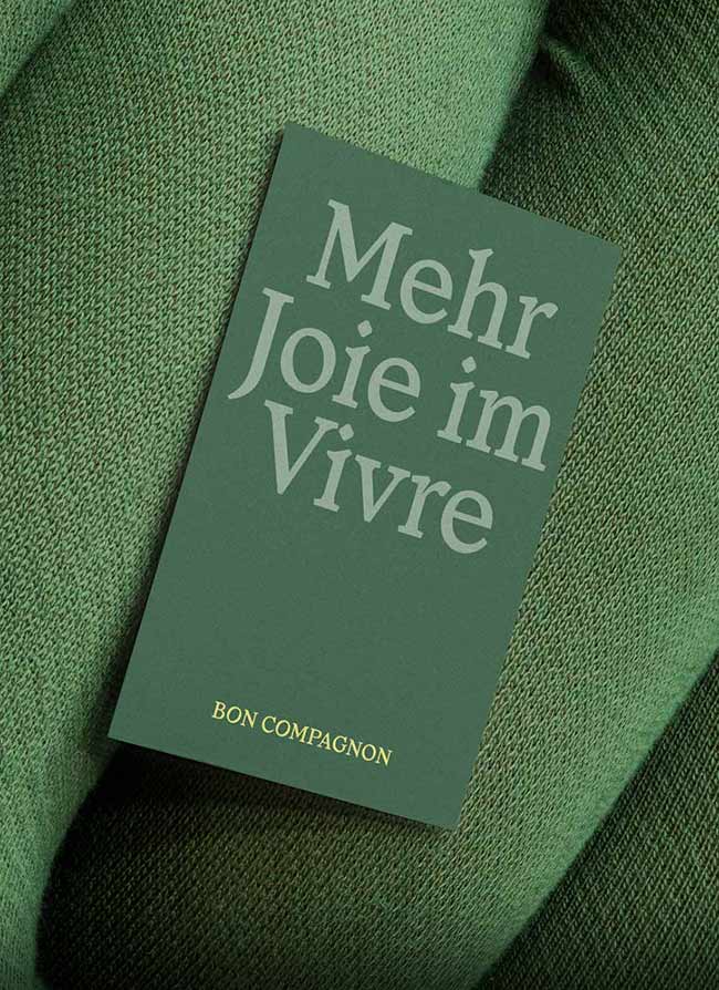
The rebranding ignited numerous positive changes within the company: The uniforms have gone fully rainbow. The website is full of life and adjusts to the clients‘ situations. Employees are accompanied on their journey with thoughtful milestone gifts. The business cards and brochures are surprising and radiate warmth. And, most importantly, Balance’s appearance in the market is second to none.
Branche
Challenge
We’re blending in with the rest of the market – everyone looks, acts, and speaks the same. We need to break away from the crowd and pour our unique identity into something tangible for the outside world
Solution
Impact
HPT now attracts 10 qualified job applicants monthly, leading to at least one new skilled hire every month
Credits
Photography Clemens Bauerfeind
Awards and Mentions
