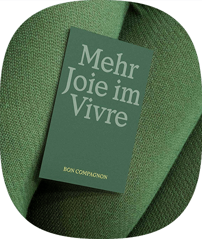


Rebranding Legal Tech, but make it Zen: From friction to flow
caralegal
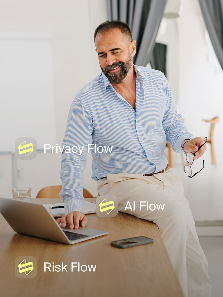
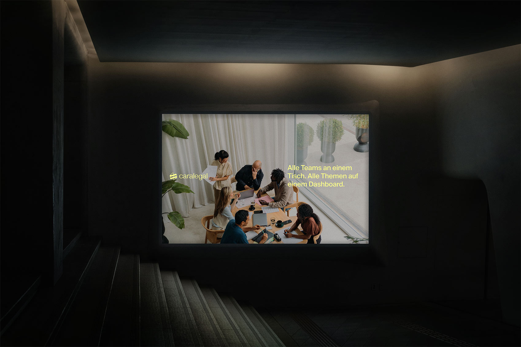
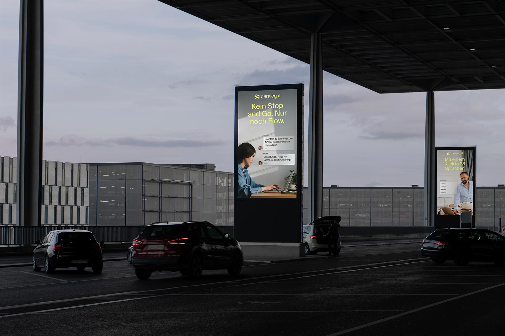
For many of us, legal data compliance makes us sweat like a sauna (tw: GDPR, AI Governance…) But caralegal’s software makes it as relaxing as one. Our task? Capture that zen vibe and show the world that legal data compliance can flow as smoothly as a steam session.
Read More


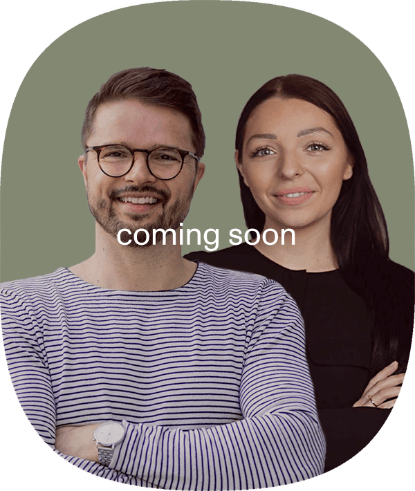
Got burning questions or big ideas?
Heiko and Caroline are all ears